UX Pricing
How Much Does UX Design Cost in London 2025?
·11 min read
When multiple teams contribute to a digital product — or multiple products share a brand — visual consistency becomes an operational challenge, not merely an aesthetic preference. Without design governance, each team makes independent visual decisions that collectively fragment the user experience, inflate development time, and erode the brand equity your organisation has invested years building. Our enterprise UI design practice addresses this systematically: establishing the token architecture, component governance, and design documentation that enable consistent, scalable, and maintainable visual design across your entire product portfolio.
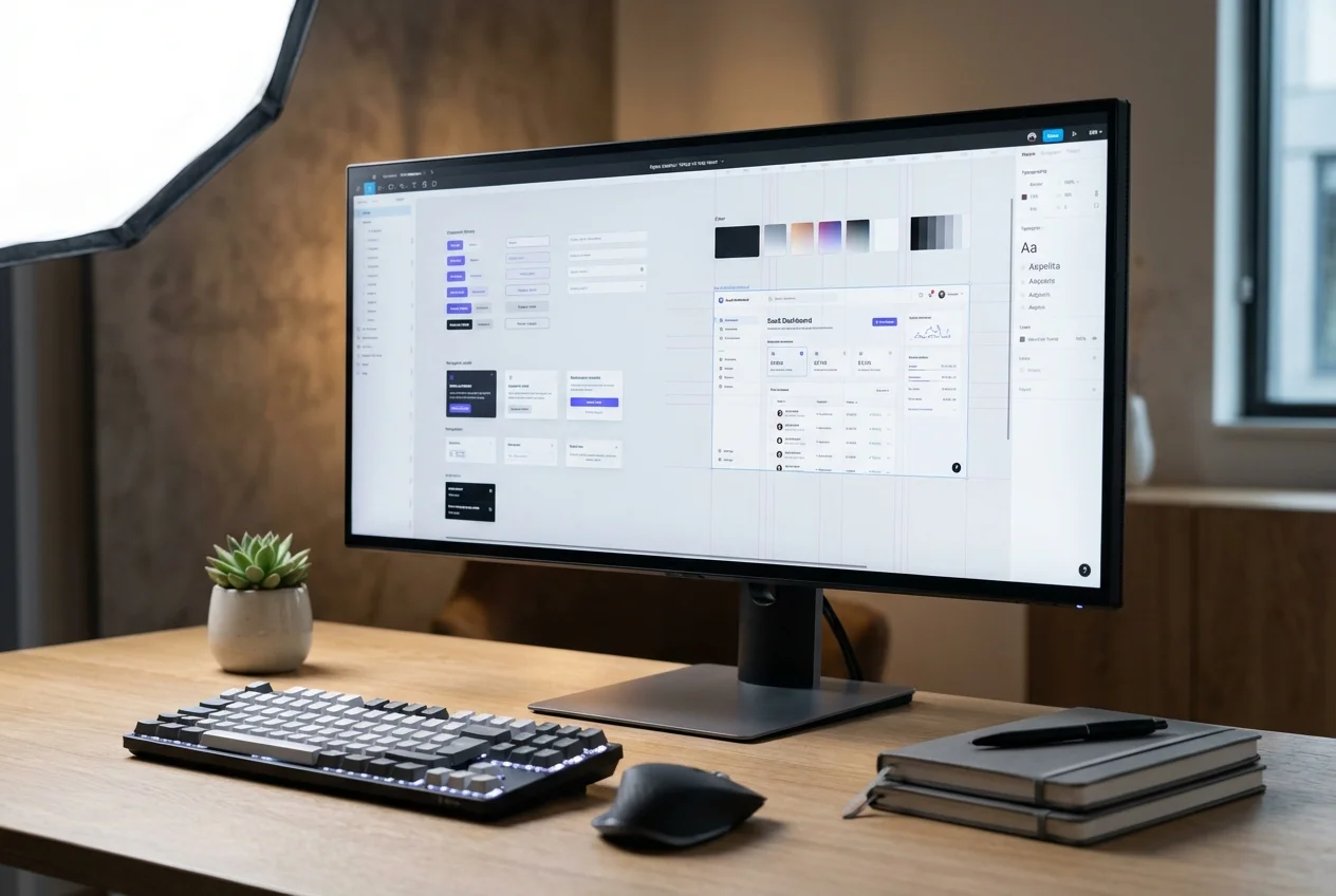
We do not start with screens. We start with the infrastructure that makes every subsequent screen consistent, accessible, and efficient to produce.
A complete design infrastructure package built for long-term organisational ownership.
Your product has reached a scale where visual inconsistency is affecting user trust and increasing development friction — developers are implementing the same pattern differently across teams because there is no shared reference. A platform modernisation or rebrand is planned, and the new visual identity must scale across multiple products and teams without fragmenting over time. Your organisation is consolidating products following an acquisition, and disparate visual languages need to be unified under a coherent brand system. Your design team is spending a disproportionate amount of time on repetitive component work rather than new feature design, and you need a systematic foundation that accelerates their output. In each case, the investment in design system infrastructure pays compound returns across every subsequent design and development cycle.
We combine visual design craft with the systems thinking that enterprise-scale products demand. Our UI designers have built and governed design systems for regulated financial platforms, multi-brand retail ecosystems, complex B2B SaaS suites, and government services — environments where design consistency is not optional and governance failures have measurable consequences. We produce design systems that your developers can implement precisely, your designers can extend confidently, and your organisation can govern effectively over years of product evolution. Every decision we make accounts for accessibility, responsive behaviour, and the long-term maintainability that distinguishes a living design system from a static style guide.
If your organisation needs design infrastructure that scales, book a free consultation to discuss your requirements.

 UX Research
 UX Audit
 Prototyping & Wireframing
 UX Strategy
 Frontend Development
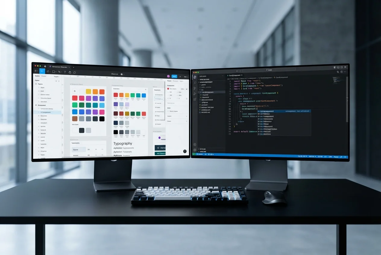 Figma to Code