How to Improve UX/UI Design on Your Website: A Step-by-Step Guide for London Businesses

Why "Improve My Website's UX/UI" Is the Wrong Question
Almost every London business owner who contacts us asks a version of the same question: "how do I improve UX/UI design on my website?" It is a sensible instinct, but it is also the wrong question. UX/UI improvement is not a discrete project — it is the outcome of a disciplined process that starts with evidence, not aesthetics. The reason most "redesigns" fail to move conversion metrics is that they begin with visual changes and end without ever having defined the user problem they were meant to solve.
This guide is the framework we use as the best UX agency London businesses bring in when they need measurable improvement, not just a fresh coat of paint. It is the same step-by-step approach we apply on engagements with retail, B2B SaaS, and fintech clients across the UK — and it works whether your site is a five-page brochure or a complex enterprise platform.
Step 1: Diagnose Before You Design — Run a Structured UX Audit
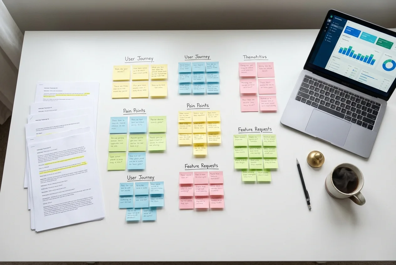
The single most expensive mistake we see London businesses make is jumping straight to redesign without first understanding what is broken and why. A structured UX audit is the cheapest, fastest way to identify exactly which parts of your site are costing you conversions, retention, and qualified enquiries.
A proper audit looks at three layers: heuristic usability (does the design follow established UX principles?), behavioural analytics (where are users actually dropping off?), and competitive benchmarking (how do alternatives in your market compare?). The output should be a prioritised list of issues, each tagged with the business impact you can expect from fixing it.
If you are scoping this internally, our UX audit checklist of 10 signs your website is losing conversions is a useful starting point — but be honest about whether your team has the time and objectivity to apply it rigorously.
Step 2: Fix the Five-Second Test First
When a visitor lands on your homepage, you have approximately five seconds to answer three questions: What is this? Is it for me? What do I do next? If your site fails any one of these, no downstream UX improvement will compensate. This is where we start every engagement.
- Headline clarity — your hero headline should describe the outcome you create for customers, not your company's heritage. "London's leading marketing agency" is not a value proposition; "We help SaaS companies grow MRR by 30% in six months" is.
- Visual hierarchy — the eye should land on the headline, then the value proposition, then the call to action. Anything else competing for that attention is a leak.
- Call to action specificity — "Get started" is weaker than "Book a free 30-minute strategy call." Specificity reduces friction.
Step 3: Map the User Journey and Identify the Drop-Off Points
Most websites lose users at predictable points: the form fold, the pricing page, the checkout step, the navigation between key pages. Open your analytics, build a funnel for each commercially important journey, and identify where the steepest drop is. That single drop-off is almost always where 80% of your improvement budget should go.
This is the diagnostic step that separates strategic UX work from cosmetic UX work. The best UX design agencies in London will not start a redesign before this map exists, because without it the design is essentially decorative.
Step 4: Improve Information Architecture Before Visual Design
Information architecture (IA) is the structure of your content — how pages relate to each other, how navigation is grouped, what users can find from where. Most "UX problems" are actually IA problems. If users cannot find pricing, cannot understand the difference between two services, or cannot navigate from a blog post to a relevant service page, no amount of UI polish will fix it.
Run a tree test or a card sort with eight to ten users from your target audience before you redesign anything. The findings will reshape your navigation in ways no internal stakeholder will predict.
Step 5: Apply UI Best Practices Where They Move the Numbers
UI improvement matters — but only after the diagnostic and structural work is done. The high-leverage UI changes we apply repeatedly across London client engagements:
- Typography hierarchy — establish three to four type sizes and use them consistently. Most underperforming sites have eight or more competing sizes that confuse the eye.
- Whitespace as a design tool — generous whitespace dramatically improves perceived quality and readability. Cramped layouts read as cheap, even when the brand is premium.
- Button contrast and prominence — primary calls to action should be the most visually prominent element on the page. We have seen conversion improve by 20%+ just from making the primary button visually dominant.
- Form simplification — every additional field reduces conversion by 5–10%. Audit every form on your site and remove every field that is not absolutely required to qualify the lead.
- Mobile-first review — over 60% of UK web traffic is now mobile. Review every page on a real mobile device, not just a Chrome simulator. The differences are often startling.
Step 6: Validate Changes With Real Users Before You Ship
Designers and stakeholders are not your users. Every meaningful UX change should be validated with a small round of usability testing before it goes live. Five users will surface roughly 80% of usability issues — testing is no longer expensive or slow, and skipping it is the most common reason expensive redesigns underperform expectations.
Our UX design process explained from discovery to launch walks through the validation cadence we use across enterprise and growth-stage engagements.
Step 7: Measure What Changed, Iterate, and Compound
UX improvement is a compounding discipline. The teams that win are not the ones that redesign once every three years — they are the ones that ship a measurable improvement every quarter. Set baseline metrics before any change (conversion rate, task completion rate, time on key pages), measure post-change, and let the data direct the next iteration.
Compounding 5% improvements across the year produces results that one-off redesigns rarely match.
When to Bring in a London UX Agency
If your team has the time, expertise, and objectivity to run the seven steps above, you can absolutely improve UX/UI on your website without external help. In our experience, most London businesses bring in a specialist London UX agency for one of three reasons: speed (you need a measurable improvement in 8–12 weeks), expertise (your team is strong on design but light on research and behavioural analytics), or objectivity (internal teams cannot see the patterns external auditors spot in a week).
If any of those apply, we offer a free 45-minute review of your current website. A senior UX strategist will identify the three highest-impact issues we can see in your funnel, give you a clear sense of what an engagement would look like, and leave you with at least three improvements you can implement immediately — whether or not you work with us.
Book your free UX review today — or explore our full range of UX services to see how we work with UK businesses to ship measurable UX improvement.
 UX Research
 UX Audit
 UI Design