From Design System in Figma to Production Component Library

Your Design System Works in Figma. Does It Work in Code?
You've invested significant effort building a design system in Figma. Your tokens are defined — colours, typography scales, spacing units, border radii, shadows. Your components have variants, states, and responsive behaviour documented. Your design team works faster and more consistently because of it.
But when those designs reach your engineering team, something breaks. The systematic relationships that make your Figma design system powerful — the tokens, the variant logic, the compositional patterns — get lost in translation. Developers rebuild each component from scratch, hardcoding values that should be tokenised, creating one-off implementations that should be variants of the same component.
The result: your codebase has a "design system" in name only. It doesn't mirror your Figma structure. It can't be updated systematically. And every time your design team updates a token or adds a variant in Figma, engineering has to manually trace and update the corresponding code across multiple components.
What a Proper Conversion Looks Like
1. Token Extraction and Implementation
Every design token in your Figma system — colours, typography, spacing, shadows, border radii, breakpoints — becomes a code token. Depending on your stack, these are implemented as CSS custom properties, Tailwind theme configuration, or styled-components theme objects. The mapping is 1:1: when your design team updates a token in Figma, there's exactly one place to update it in code.
2. Component Architecture
Your Figma component structure defines your React component architecture. A Button with size variants (small, medium, large), style variants (primary, secondary, ghost), and states (default, hover, active, disabled, loading) becomes a typed React component with those exact props. Not a rough approximation — an exact mapping.
// Your Figma variants become typed props
interface ButtonProps {
  size: 'small' | 'medium' | 'large';
  variant: 'primary' | 'secondary' | 'ghost';
  state?: 'loading' | 'disabled';
  children: React.ReactNode;
}
3. Compositional Patterns
Figma's nested instances and slot patterns map directly to React's composition model. A Card component that accepts a CardHeader, CardBody, and CardFooter in Figma becomes a compound component in React with the same compositional API. The design team's mental model of how components fit together is preserved in code.
4. Responsive Logic
Your Figma responsive specifications — different layouts at different breakpoints, elements that show/hide, spacing that scales — are implemented as responsive utilities or component-level responsive logic. Not generic CSS media queries, but intentional responsive behaviour that matches your specific design decisions at each breakpoint.
5. Documentation
Every component gets Storybook documentation that mirrors your Figma documentation. Designers and developers reference the same component — the same variants, the same states, the same responsive behaviour — just in different tools. Storybook becomes the engineering team's equivalent of Figma's component library panel.
The Conversion Process
- Audit: We review your Figma design system for completeness and consistency. Are all tokens defined? Are component variants comprehensive? Are responsive specifications documented? We flag gaps before development begins.
- Token Layer: We extract and implement all design tokens. This is the foundation — every component references tokens, never hardcoded values.
- Primitive Components: Buttons, inputs, typography elements, icons — the atoms of your system. Built with full variant support, proper accessibility, and comprehensive state handling.
- Composite Components: Cards, modals, navigation, forms — components composed from primitives. Built using the same compositional patterns as your Figma components.
- Complex Components: Charts, data tables, dashboards, animated sections — the highest-complexity components that require specialist implementation.
- Documentation & Handoff: Storybook setup, component API documentation, integration guide, and technical walkthrough with your engineering team.
Common Mistakes to Avoid
- Skipping the token layer: If developers hardcode colour values and spacing instead of referencing tokens, you don't have a design system in code — you have a collection of components that happen to look consistent today but will drift over time.
- Ignoring variant logic: Building separate components for each variant instead of a single component with variant props defeats the purpose of a system. Your Button component should handle all button variants, just like it does in Figma.
- Treating responsive as an afterthought: Responsive behaviour should be part of each component's implementation, not bolted on with generic media queries later.
- No documentation: A component library without documentation is a liability. If developers can't discover and understand components easily, they'll rebuild them — and you'll have duplication instead of a system.
The ROI
A properly implemented design system in code pays for itself within months:
- Faster feature development: Developers compose with existing components instead of building from scratch. Features that took weeks take days.
- Design consistency: Every screen built from the same components automatically looks consistent. No more visual drift between pages or features.
- Easier updates: Change a token or component variant once, and it updates everywhere. Design refreshes that previously required weeks of development become straightforward.
- Better designer-developer collaboration: When code mirrors Figma, designers and developers speak the same language. Handoff friction disappears.
If you have a Figma design system that needs to become a production component library, book a free consultation. We'll review your design system structure and give you a realistic assessment of what the conversion would involve.
 UI Design
 Frontend Development
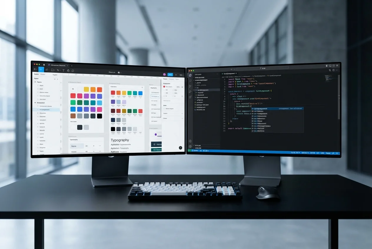 Figma to Code