Ecommerce UX Agency London: How Expert UX Design Boosts Online Store Conversions
Why Your Ecommerce Store Needs a Specialist UX Agency
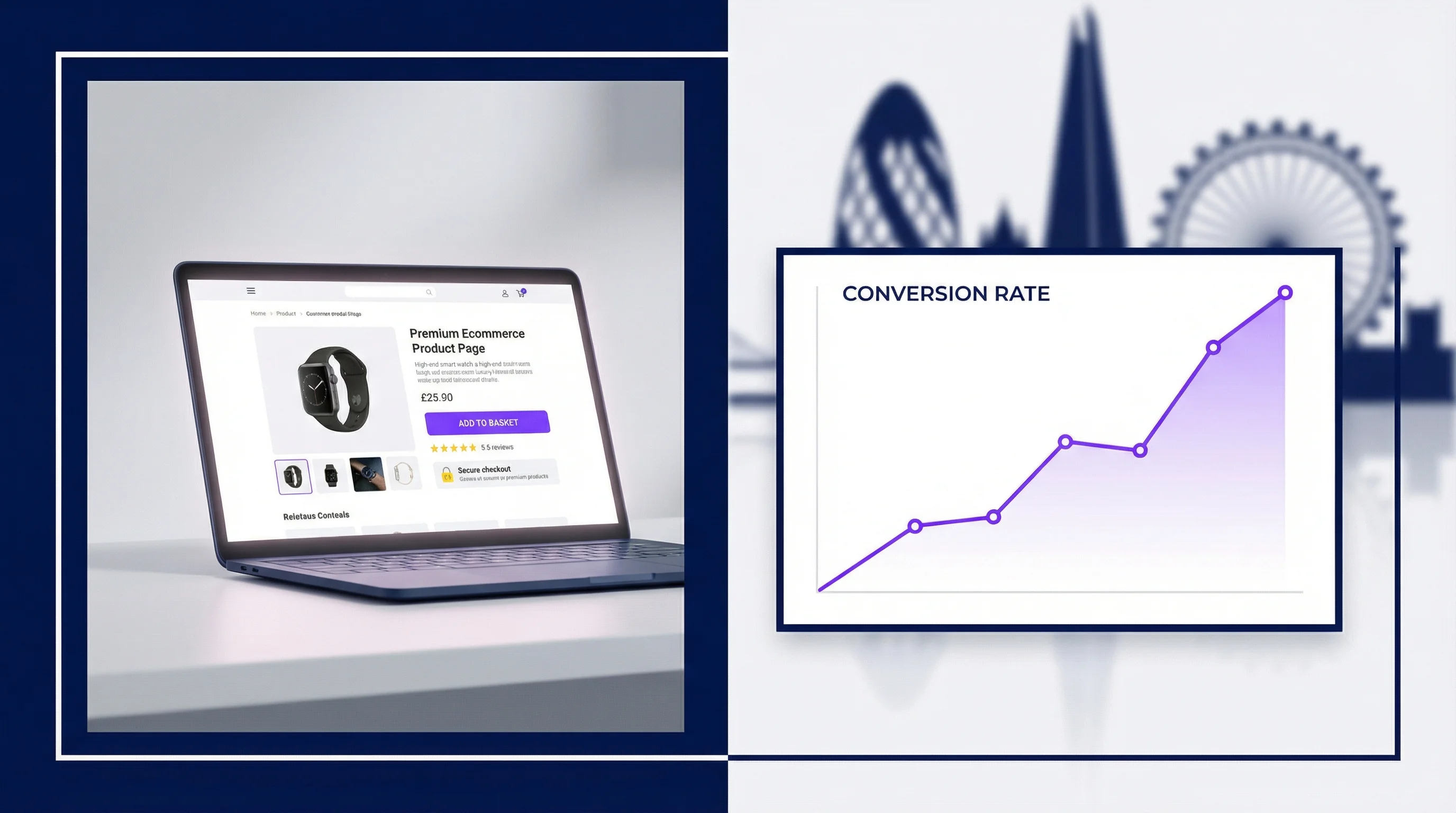
Most ecommerce businesses focus their optimisation efforts on marketing — driving more traffic through paid ads, SEO, and email campaigns. Yet the conversion rate of the average ecommerce site sits stubbornly between one and three percent. That means for every hundred visitors you pay to acquire, ninety-seven or more leave without buying. The problem is rarely the traffic. It is the experience.
A specialist ecommerce UX agency in London approaches this differently. Rather than asking "how do we get more visitors?", we ask "why are the visitors we already have not converting?" The answer is almost always rooted in user experience: a confusing navigation structure, a checkout flow that erodes trust, product pages that fail to answer the buyer's key questions, or a mobile experience that makes purchasing feel like work.
This guide explains the evidence-based approach our UX agency London team uses to diagnose and fix ecommerce conversion problems — and the specific techniques that consistently deliver the highest return on investment.
The Real Cost of Poor Ecommerce UX
The Baymard Institute has spent two decades researching ecommerce usability. Their most recent large-scale checkout usability study found that 70.19% of shopping carts are abandoned before purchase. More importantly, they found that the average large-scale ecommerce site can achieve a 35% increase in conversion rate through better checkout design alone.
Consider what that means for your business. If your store generates £500,000 in annual revenue at a 2% conversion rate, a 35% improvement in checkout conversion translates to an additional £175,000 per year — from the same traffic budget. That is the compounding business case for investing in ecommerce UX.
How an Ecommerce UX Agency Diagnoses Conversion Problems
Before recommending any design changes, a rigorous ecommerce UX agency runs a structured diagnostic process. At our London UX agency, this always begins with data — not assumptions.
Quantitative Funnel Analysis
We map the full purchase journey as a conversion funnel: landing page → category browse → product page → add to basket → checkout initiation → checkout completion → order confirmation. At each step, we measure the percentage of users who proceed to the next step. Steps with significantly higher drop-off rates than those surrounding them are the primary targets for UX intervention.
A well-implemented analytics setup (Google Analytics 4, Mixpanel, or similar) will show you this data at the aggregate level. We go deeper — segmenting by device type, traffic source, user cohort, and product category to identify patterns that aggregate data masks. Mobile checkout drop-off is consistently higher than desktop in most stores we audit, but the specific friction points differ by site and audience.
Session Recording and Heatmap Analysis
Quantitative data tells you where users are dropping off. Qualitative tools tell you why. We use session recording platforms — Hotjar, FullStory, or Microsoft Clarity — to watch recordings of real purchase sessions, with particular focus on sessions that reach checkout but do not convert.
Common patterns we identify in ecommerce UX audits include: rage clicks on non-interactive elements (a strong signal that users expect something to be clickable that is not), hesitation before entering payment details (a trust signal failure), and repeated scrolling back and forth on product pages (a sign that users cannot find the information they need to commit to purchase).
Moderated User Testing
For stores with significant revenue at stake, we supplement remote analytics with moderated usability testing — either in-person at our London facility or via remote video sessions. We recruit participants who match your actual customer profile and give them realistic purchase tasks. Watching a real potential customer encounter your checkout for the first time is invariably the most powerful diagnostic tool available. The confusion, hesitation, and workarounds users employ surface issues that no amount of data analysis would reveal.
The Five Highest-Impact Ecommerce UX Improvements
Based on our work with ecommerce clients across fashion, electronics, homewares, health, and B2B supply categories, these are the improvements that consistently deliver the greatest conversion uplift.
1. Simplify and Trust-Signal the Checkout Flow
The checkout is where purchase intent converts to revenue — or evaporates. The most impactful changes are often the simplest: reducing the number of form fields (research shows removing a single mandatory field can improve completion rates by 3–5%), adding trust signals at the payment step (SSL badges, return policy reminders, recognisable payment method logos), and providing a clear progress indicator so users know how close they are to finishing.
Guest checkout is non-negotiable. Forcing account creation before purchase is one of the most commonly cited reasons for checkout abandonment. Offer account creation after the order is confirmed — when the user has already committed and has an incentive (tracking their order) to create an account.
2. Optimise Product Pages to Resolve Buying Objections
A product page has one job: give the user everything they need to feel confident enough to add the item to their basket. Most product pages fail at this because they are built from the seller's perspective rather than the buyer's. Our UX research process identifies the specific questions buyers have before purchasing in your category — and we redesign product pages to answer those questions clearly and at the right point in the user's reading flow.
High-quality photography from multiple angles, size guides that prevent returns, social proof in the form of verified reviews, clear stock availability, and transparent delivery information are table stakes. Beyond these, category-specific content matters enormously: nutritional information for food products, material composition for clothing, compatibility details for electronics, and credentials for professional services.
3. Fix Mobile Checkout UX
In most ecommerce categories, more than 60% of traffic comes from mobile devices — but mobile conversion rates are typically 30–50% lower than desktop. The gap is almost entirely explained by a worse checkout experience on mobile: tiny tap targets, keyboard types that do not match input fields (triggering a number keyboard for a postcode field, for example), and checkout flows designed for desktop that have simply been scaled down rather than redesigned for touch interaction.
As a specialist ecommerce UX agency, we approach mobile checkout as a distinct design problem from desktop. We prototype and test mobile flows separately, using real devices rather than browser emulators, and we pay particular attention to the keyboard and autofill experience — because on mobile, form completion is the primary friction point.
4. Improve Search and Navigation
Users who search on an ecommerce site convert at two to three times the rate of users who browse. Yet most ecommerce search implementations are poor: they do not handle synonyms, misspellings, or natural language queries; they return irrelevant results; and they provide inadequate filtering options. Improving on-site search and category navigation consistently ranks among the highest-ROI ecommerce UX investments available.
Our UX audit service includes a full review of search performance using analytics data — identifying the queries that return zero results, the queries where users refine their search (a signal of poor initial results), and the navigation paths that lead to the highest drop-off rates.
5. Reduce Friction at the Basket Stage
The basket page is often overlooked in ecommerce UX optimisation, but it is a critical juncture. Users who reach the basket have demonstrated strong purchase intent — yet basket-to-checkout conversion rates are frequently below 50%. Common issues include: a basket that does not clearly show what has been added (leading users to second-guess whether the item was added successfully), an upsell or cross-sell section that distracts rather than adds value, and a lack of urgency signals when stock is genuinely limited.
What to Expect From an Ecommerce UX Project
A typical ecommerce UX engagement with our London UX agency follows a structured three-phase process:
Phase 1 — Diagnostic Audit (2–3 weeks): Analytics review, session recording analysis, heuristic evaluation, and user testing. Deliverable: a prioritised recommendations report with business impact estimates for each issue identified.
Phase 2 — Design Sprints (4–8 weeks): Wireframes and high-fidelity designs for the highest-priority pages and flows, with prototype testing to validate improvements before development. Deliverable: tested, developer-ready Figma files with full annotations.
Phase 3 — Measurement and Iteration (ongoing): Post-launch analytics review to measure the conversion impact of changes. A/B testing recommendations for further optimisation. Deliverable: monthly performance reports with clear attribution of design changes to revenue impact.
Choosing the Right Ecommerce UX Agency in London
The London market has no shortage of digital agencies that offer UX services. When evaluating an ecommerce UX agency, look for three things: evidence of ecommerce-specific work (case studies with conversion metrics, not just aesthetics), a research-led methodology (avoid agencies that jump straight to design without a diagnostic phase), and transparent pricing with clearly defined deliverables.
Be cautious of agencies that promise dramatic conversion improvements without a diagnostic phase, or that present generic ecommerce best practices as customised recommendations. The best ecommerce UX work is always grounded in your specific users, your specific funnel data, and your specific category dynamics.
You can see examples of our conversion-focused work in our UX audit service and UI design service pages. We are also happy to review your current analytics setup and give you an honest initial assessment of where your biggest opportunities lie.
Start With a Free Ecommerce UX Review
If your ecommerce conversion rate is underperforming relative to your traffic investment, a structured UX review is the fastest way to identify what to fix and in what order. Our UX agency London team offers a free 45-minute consultation where we will look at your store, review your key metrics, and give you three specific, actionable recommendations — with no obligation to engage further. Book your free ecommerce UX consultation today and find out exactly what is standing between your current conversion rate and the one you deserve.
 UX Research
 UX Audit
 UI Design